The Group node
The Group node
The Group node is the most basic visual element and is used to structure layouts, group content, and create visual shapes.
If you are familiar with HTML code, a Group is similar to a <div>-tag in HTML.
This tutorial will show you the basic concepts of Noodl, which will enable you to build powerful web applications.
We will build the small app shown in the video above, and introduce Noodl concepts along the way. Once you learn these concepts, and how to combine them, there will be virtually no limit to what you can create.
One of the core concepts of Noodl is the node graph. It's a collection of nodes (think of them as LEGO blocks) and connections between these nodes.
A node represents an element of your app. It can be a visual element like a Rectangle or something that's not directly visible, like a logical Counter node that operates on a number. When we connect these two nodes, it becomes a node graph.
With a node graph, we can create everything from prototypes to powerful web apps, which can be deployed directly from Noodl. Check out the graph above, and don't worry if it looks complicated at first, we'll build it from scratch during this lesson.
Almost all projects you will be creating have a visual user interface, be it a mobile or desktop app.
For that, we use visual nodes, such as the Group node and the Text node. These nodes are blue and are arranged in a hierarchy. The top node acts as the root, and all visual nodes nested within will be a part of the interface of your app.
You can move nodes by dragging them around with the left mouse button. You can drag a node in and out of the visual hierarchy. Nodes outside the hierarchy won't be a part of your interface.
During this tutorial, you will be given multiple tasks. Spot them in the tutorial timeline by the “Task” label.
Click on the card to get a hint of how to complete the task.
Try dragging the text node away from the hierarchy. As you can see, the text disappears from the preview.
You can add a node as a child to another node by dragging it onto that node, which will place it as the last child. Try dragging the text node onto the root group. The text will now be visible again in the preview
We will not be needing the text node, so delete it. Click it and press delete/backspace.
If you make a mistake when editing you can use Cmd-Z, or Ctrl-Z, to undo your last change.
Open the node picker by clicking the "plus" icon in the top bar, or right click in the empty space of the node graph.
Here you can browse all the core nodes in Noodl and their categories, and read about how to use them.
Under each category, you can see the corresponding nodes. Create nodes by clicking on them.
The Group node is the most basic visual element and is used to structure layouts, group content, and create visual shapes.
If you are familiar with HTML code, a Group is similar to a <div>-tag in HTML.
Open the node picker by pressing the "+" icon in the top menu, or right click on node canvas.
You can search for a node in the Node Picker's search field, or pick it from the UI Elements category.
All nodes have parameters that you can edit to make them behave the way you want. For instance, visual nodes have parameters that affect their appearance, position, etc.
If you select a node by left clicking on it, you will see the parameters of that node in the sidebar to the left.
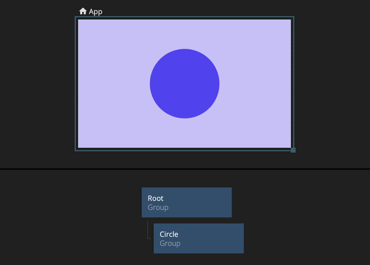
Edit the Width and Height parameters of the Group so they're set to 300px instead of 100%.
Edit the Align X parameter to be centered in the middle.
We can turn the Group into a circle by changing its border radius to 100%.
As we build our app it's good practice to give nodes descriptive names. This makes it easier for collaborators, and yourself, to understand what the different nodes are doing.
Select the node and change its name by pressing enter. You can also double-click the node title in the side panel, or click the edit icon as shown in the video.
Select the node and change its name by pressing enter. You can also double-click the node title in the side panel, or click the edit icon as shown in the video.
Groups are the main building blocks for any layout. We can nest other visual elements as children of a Group to start creating more advanced layouts.
In this example, we will insert a Text node and place it in the middle of the Group called Circle.
Use the Node Picker to place a Text node and add it as a child to the Group called Circle
Noodl comes with a set of pre-styled UI controls, so you easily can place a button, a checkbox, or a slider into your application.
All controls have a wide range of properties that allows them to be styled and customized.
With dimension modes, we can set rules for how visual elements should take up space.
If we want our button to take up 100% of the available width, and we have a fixed height set in pixels, we can set its dimension mode to Explicit width & height in the sidebar.
Noodl comes with a variety of nodes for creating logic and functionality. These nodes are grey and can be found under the Logic and Utility node category in the node picker. These nodes can't be part of the visual tree as they represent logic. They can be placed freely anywhere in the node graph around the visual nodes.
Most nodes take inputs and outputs from other nodes via connections. This is how you build up functionality in Noodl.
We will use a Counter node to increase a number when the button is clicked.
You can create a connection between two nodes by dragging from one node to another.
Hover over the edge of the white dot on a node. A connection will be created when we start dragging.
Drag the connection on top of another node, and release to bring up the Connection Panels. Pick an output from the source node, and select an input on the target node. This will create a connection between them.
Connect the Click event from the Button node to the Increase Count action on the Counter node
A powerful feature of Noodl is how data and signals are visualized.
Hover over a connection to see the current value. If you click on the tooltip you can pin it so it stays visible when you stop hovering. This makes it easy to debug your application.
Connect the Click event from the second Button node to the Reset event on the Counter node.
You've completed this tutorial, we hope you liked it!
To take your Noodl skills to the next level we recommend our second lesson on how to create lists from data.
Happy Noodling!